
Mobile Site Designers in Kansas City / Liberty mo
Why a Responsive Mobile site Is NOT Enough—You Need a Custom Mobile Website Designer
Mobile Users Expect More. Are You Delivering?
A responsive website adjusts to different screen sizes—but that doesn’t mean it provides the best mobile experience. Today’s users expect speed, simplicity, and seamless navigation. If your mobile site is just a scaled-down version of your desktop site, you’re already falling behind.
The Problem with “Responsive” Websites
- They adapt—but they don’t optimize for mobile behavior
- They may be slow, leading to higher bounce rates
- Navigation often feels clunky on smaller screens
- They prioritize desktop features instead of mobile-first design
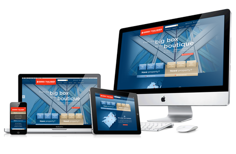
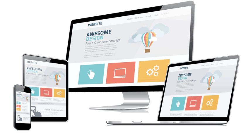
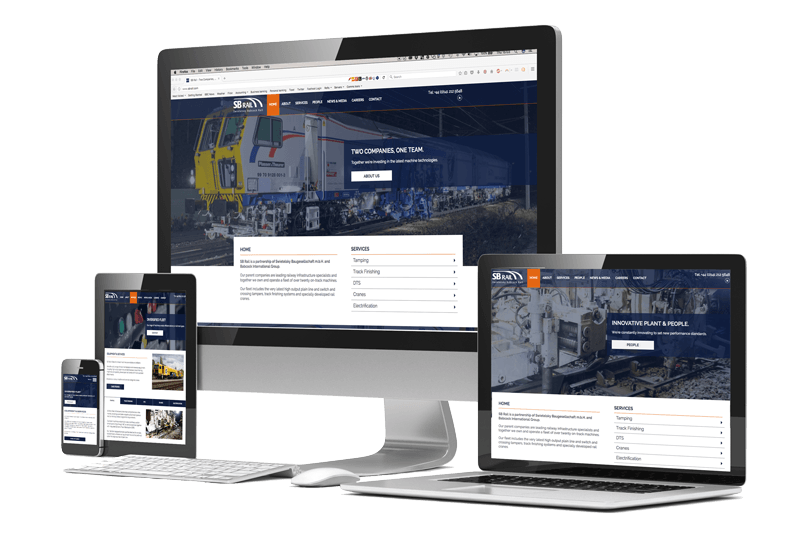
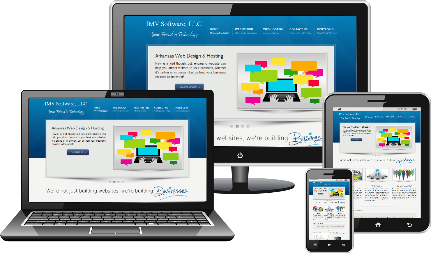
Custom Mobile Websites: The Game Changer
A
custom mobile website
isn’t just a resized version of your desktop site—it’s built
specifically for mobile users
with:
- Lightning-fast load times – Because speed matters.
- Touch-friendly navigation – No more tiny buttons and frustrating menus.
- Mobile-first UI/UX – Designed for swipes, taps, and instant engagement.
- Better SEO & conversions – Google prioritizes mobile-friendly experiences.
Why You
Need a
Professional Designer
Sure, there are DIY website builders, but they often result in clunky, unoptimized mobile experiences. A
custom-designed mobile site
ensures:
1. A Unique Look –
Your brand stands out with a tailored design
2. Optimized Performance –
Faster loading times and smooth functionality.
3. Seamless UX – Designed with real users in mind, not just templates.
4. Boost Conversions – The ultimate goal is to make buying effortless and engaging. A custom-designed website ensures your customers find what they need quickly—leading to more sales and higher satisfaction..
